PSJD Changes: Tomorrow (10/10)!

Sam Halpert, NALP Director of Public Service Initiatives
Hi everyone!
Regular readers of our Public Interest News Digest may have noticed that we discontinued our weekly dispatches for a couple months over the summer. Since the Digest made its return this fall, I’ve hinted a few times that big changes were underway for PSJD.org.
I’m excited that beginning tomorrow morning you’ll be able to see where our time has been going in recent months. Visitors to PSJD.org tomorrow will find a whole new layout! Each page on PSJD has been re-designed based on common questions and problems we’ve encountered over the years when working with jobseekers and employers. Our hope is that the new site will feel more consistent, more immediate, and more intuitive for users.
Many things will change. In this post I’ll call your attention to just a few examples.
More Consistent
Throughout the site, we’ve looked at the different ways in which similar features have been presented in the past and worked to provide a single, predictable experience.
On today’s PSJD.org, when jobseekers and school administrators log in they’re able to bookmark the site’s content so that they can refer to it later. This goes for their search results and also for individual job notices, employer profiles, and resources in the resource library. But when you want to create a bookmark in each of these places, the button you need to press has a different label depending on which type of page you’re bookmarking–and is located in a different spot on each type of page as well.
On tomorrow’s PSJD.org, every type of page that can be bookmarked will have a bookmark button in the same place. So once you know where to look, you’ll never have to wonder if you’re missing something.
More Immediate
In the time since PSJD.org was last updated, the web has changed a lot. New options are available that make sites more immediately responsive.
On today’s PSJD.org, if you want to select a city from search returns, you have to scroll down a long list of checkboxes and hunt for it. If you want to reset your password, you visit a separate page from the one you were hoping to access and then must navigate back to where you were.
On tomorrow’s PSJD.org, search results can be refined with select boxes where as soon as you begin typing the option you’re looking for the list of results will narrow to only the possibilities you care about. When you ask for a new password, the form you need will appear in a popup, so you can make your request and then get right back to what you were doing.
More Intuitive
In phone conversations and via email over the years, we’ve developed a pretty good sense of which parts of PSJD do things that our users don’t expect. With this update, we’ve worked to eliminate these areas of confusion wherever possible. We hope the new site will do more to explain what is happening–and why–for users on the platform.
On today’s PSJD, we use icons to communicate concepts, like a rolling deadline or an archival job post.
On tomorrow’s PSJD, whenever you encounter an icon button, you can hover on it (or long-press) to get some explanatory text that will let you know what that button does. Status messages, which before were sometimes buried in the main text of the page in ways that users did not always notice, should be more obvious.
On today’s PSJD, if you want to understand how to use the platform you can download a PDF from the “About PSJD” section and follow along. (Or, of course, send us an email or give us a call.)
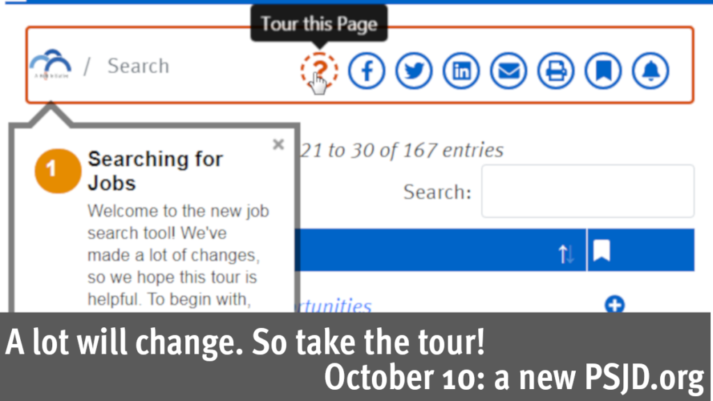
On tomorrow’s PSJD, pages will contain an ‘?’ button. When you press it, you’ll get a tutorial on how to use the portion of the site you’re currently viewing that’s specific to your user type (e.g., jobseeker or employer).

So if you load PSJD.org tomorrow and things look a bit different, try the tour! And of course, even though we hope it will be easier for you to find your way around without getting in touch we are still happy to answer your emails and take your calls.
Hope you enjoy the new site,
Sam

